 31
May
2023
ISET Economist Blog
 Monday,
14
May,
2018

 Monday,
14
May,
2018
If you are a governmental stakeholder, civil society organization, research institute, or a concerned citizen pondering the state of the environment, the biennial Environmental Performance Index (EPI) tells an inconvenient truth regarding the trajectory of each country and its performance. The rankings provide unpolished results concerning countries and their commitments, or lack thereof, to the Sustainable Development Goals (SDGs) and other complementary international agreements. The EPI list should provide signposts for policymakers to fathom what actions are needed to reverse negative impacts on the environment and its citizens. So, what is EPI and what does this year’s result say about Georgia? Is there any specific indicator that we all should feel concerned about?
The EPI, a list produced by prestigious Universities such as Yale and Columbia with support from the World Economic Forum, has been presenting data on various countries and their performance since 2002. The current list reveals the scoring of 180 countries and their individual performance regarding Ecosystem Vitality (the protection of, e.g. natural resource services) and Environmental Health (e.g., progress in air pollution or protection of drinking waters that can endanger human health if not considered). These two categories are divided into 10 groups in total (e.g. Forest, Air Quality, and Water Resources), and in turn, these groups constitute 24 indicators altogether. For example, Tree Cover Loss is an indicator for Forest (which is subcategorized under Environmental Health), and Waste Water treatment is an indicator for Water Resources (subcategorized under Ecosystem Vitality). All objectives, groups, and indicators are given individual points that constitute the final score. For a complete scheme where the two objectives, 10 groups, and their 24 indicators are presented, see the EPI website. What makes the EPI a pedagogical tool for any policymaker who wishes to look more closely at this year’s result (or for that matter, all EPI lists since its inception), is the immense transparency offered. For each analyzed indicator, one will find a set of sources used such as international organizations that provided data or contributed with extensive research.
Scratching the surface of this year’s result, we note that Turkmenistan ranked the highest amongst the Former Soviet Union (FSU) countries, see Table 1. They performed well, especially with regard to Environmental Health indicators. Georgia ranks in 94th place (it was in 111th place in 2016) and scores a bit higher in Environmental Health than in Environmental Vitality. Azerbaijan, on the other hand, had the highest scores in Environmental Vitality, compared to their performance in Environmental Health, among all the FSU countries. As summarized in Table 1, the FSU countries are compared with this year’s top country, Switzerland. Although a comparative list as shown is easy on the eyes, there may be an unexpected, glitch in this comparison.
Table 1. Compilation of FSU countries and Switzerland regarding their scores in this year’s EPI ranking.
| Country |
EPI – ranking 2018 (ranking 2016) |
Environmental Performance Index, score |
Environmental Health, score (ranking 2018) |
Environmental Vitality, score (ranking 2018) |
| Switzerland | 1 (16) | 87,42 | 93.57 (18) | 83.32 (1) |
| Turkmenistan | 38 (84) | 66.10 | 73.53 (49) | 61.15 (52) |
| Belarus | 44 (35) | 64.98 | 69.55 (67) | 61.94 (48) |
| Azerbaijan | 59 (31) | 62.33 | 48.55 (124) | 71.52 (7) |
| Armenia | 63 (37) | 62.07 | 56.85 (109) | 65.56 (27) |
| Georgia | 94 (111) | 55.69 | 57.10 (108) | 54.75 (82) |
| Ukraine | 109 (44) | 52.87 | 64.44 (87) | 45.16 (139) |
| Moldova | 112 (55) | 51.97 | 60.29 (102) | 46.42 (127) |
| Uzbekistan | 136 (118) | 45.88 | 50.67 (118) | 42.69 (146) |
But first, what does the ranking tell you? Primarily, it tells you how far, or close to, a country is to achieve environmental policy objectives. If a country scores low on EPI it needs to scale up its efforts in several areas. The downfall – the glitch – for the EPI project is the lack of data especially in areas such as water management, biodiversity loss, and agriculture. The EPI team has made an urgent call to improve data collection, verification, and reporting. A compelling solution to this would be to create an enhanced global data system that could result in “…better management of sustainable development challenges.” (EPI, 2018). However, establishing such a system is paired with some difficulties and challenges, which need to be jointly met by a range of stakeholders such as researchers, the civil and private sectors, and governments (WorldBank, Discussion Draft, 2017). Despite the highlighted weaknesses that challenge the project, the main finding of this year concerns the inability across nations to improve air quality. This is exacerbated by increased urbanization. So, what can be said regarding Georgia’s scoring in air quality?
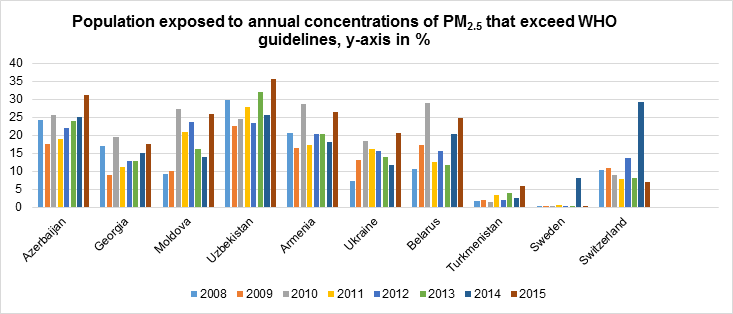
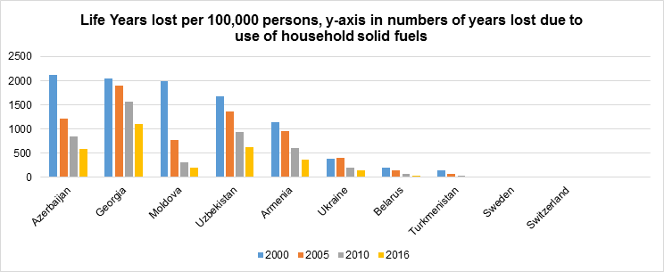
The basic need to breathe fresh air, free from particulate matter, sulfur dioxide, and the like, has been constantly challenged also thanks to industrialization. What complicates the issue is that it is not only outdoor air that is at stake but also the indoor environment due to household solid fuels (use of indoor fires for cooking etc.). To fully grasp the magnitude of the problem for Georgia and the FSU countries, I will present two figures showing the proportion of people exposed to PM2.5 that exceeds WHO’s guidelines (Figure 1) and the numbers of lost lives (Figure 2) due to exposure of household solid fuels. The PM2.5 pollutant is a small but deadly particulate matter that can derive from combustion sources, causing severe breathing problems as well as cardiovascular disorders (World Health Organization, 2006a; EPI, 2018).
Figure 1. Georgia exceeded WHO’s guidelines with 17.5 % of PM2.5 exposure in 2015.

Figure 2. For the case of Georgia, the use of household fuels causes in 2016 that out of 100’000 inhabitants’ 1106 life years were lost, making the country the leading nation amongst FSU countries.

With a few exceptions, it is quite clear that instead of a steady decline in exposure to PM2.5, many countries are recording increasing numbers. As seen in Figure 1, they are even exceeding the current level of pollution compared to 2008 levels. But how far off is Georgia regarding the guidelines outlined by WHO, really? Considering that the typical Georgian citizen was exposed to 15 µg/m3 of PM2.5 in 2015 (measured in mean annual concentration) and cross-checking this number with the information provided in Table 2, Georgian air quality is still poor. With exposure at even 10 µg/m3 of PM2.5 WHO has established, with a 95% confidence rate, the connection between these levels and mortality caused by heart and lung diseases. At the lowest level recorded in 2009 (11 µg/m3 of PM2.5), Georgia still exceeded the WHO air quality guideline.
In order to highlight the consequences of bad air quality, the EPI has provided a data set stretching from 2000-2016, estimating the number of life-years lost as a consequence of poor air quality. As can be seen in Figure 2, Georgia tops the FSU countries with a staggering four-digit number (the year 2016), with 1,107 life years lost per 100,000 persons. Fortunately, as noted in Figure 2, a steady decline of life-years lost can be registered from the year 2000 and onwards, not just for Georgia but also all FSU countries. So, what can be done to curb the emissions? Are there any specific targets to focus on?
Table 2. Interim targets and AQGs in annual mean concentrations.
| Interim target |
PM2.5 (µg/m3) |
Basis for the selected level |
| 1 (IT-1) | 35 | These levels are associated with about a 15% higher long-term mortality risk relative to the AQG level. |
| 2 (IT-2) | 25 | In addition to other health benefits, these levels lower the risk of premature mortality by approximately 6% [2–11%] relative to the IT-1 level. |
| 3 (IT-3) | 15 | In addition to other health benefits, these levels reduce the mortality risk by approximately 6% [2-11%] relative to the -IT-2 level. |
| Air quality guideline (AQG) | 10 | These are the lowest levels at which total, cardiopulmonary and lung cancer mortality have been shown to increase with more than 95% confidence in response to long-term exposure to PM2.5. |
Adjusted table showing air quality guidelines and interim targets for particulate matter emissions set by WHO. Unit: annual mean concentrations. The guidelines should not be seen as thresholds as neither standards nor guidelines will meet levels of exposure that have no adverse effects on human health. Source: World Health Organization (Ed.). (2006a, p. 11).
As neither the interim targets nor the air quality guidelines (AQGs) from WHO should be used as thresholds, the government should consult stipulated documents such as The European Associate Agreement (AA) with Georgia. The AA refers to Directive 2008/50/EC, which aims to improve ambient air quality in Europe. This directive settles the requirements for the assessment of concentrations regarding ambient air quality. The limit value is set to 24 µg/m3 of PM2.5 annual average. Within these limits, the directive has outlined an upper and lower assessment threshold of 70 % of the limit value and 50 % of limit value, respectively. Would Georgia be even close to reaching any of these values? With an exposure level of 15 µg/m3 of PM2.5 in 2015 (as recorded in the EPI-dataset), Georgia somehow places itself in the middle. The good news is, of course, that Georgia is fulfilling the objectives spelled out by the directive and has done so for many years (below 24 µg/m3 of PM2.5). Although Georgia has not yet gone below 10 µg/m3 of PM2.5, it did already reach the directive’s lower assessment threshold in 2009.
To this day, air quality remains one of the few indicators that both Georgian leaders and world leaders seem to struggle greatly with, as shown by this year’s EPI. A study conducted in 2013 by WHO and the Institute for Health Metrics and Evaluation suggests that air pollution causes 5.5 million early deaths per year worldwide (World Bank & Institute for Health Metrics and Evaluation, 2016, p. 22). It is imperative that policymakers join forces to curb this pressing issue once and for all.
As a final note and reminder, I wish to stress that the EPI should serve as an indicative tool, and each individual result can work as a catalyst for policymakers to further improve and perfect actions that will reduce environmental impacts. Thanks to the EPI’s transparency, policymakers can in fact consult the various documents provided by the EPI team. This enables a fairer picture of each country and their individual result, with the help of aggregated data, and can also serve as an annotation of past records.


